

When first planning the new composer we heard a clear message:
“The skuid page building experience is TOO different from the resulting run-time experience. Other app building tools are increasingly making the build environment provide a very close representation of what the app will actually look like.
So in the new composer we are leaning towards WYSIWYG. The builder looks much more like the run time.
Benefits of WYSIWYG
-
Design System integration. No longer will your page building be in a “design free wireframe.” The decisions you make in the design system will show immediately in your build environment. Turn the page background pink in the design system, save the system and refresh it in the page properties of the composer. You’ll see the pink!!
-
Live views of margins and grid spacing. All the spacing properties you fiddle with to let a page breathe – they will be shown at build time. You don’t have to preview the page to test whether you got the grid properties right.
-
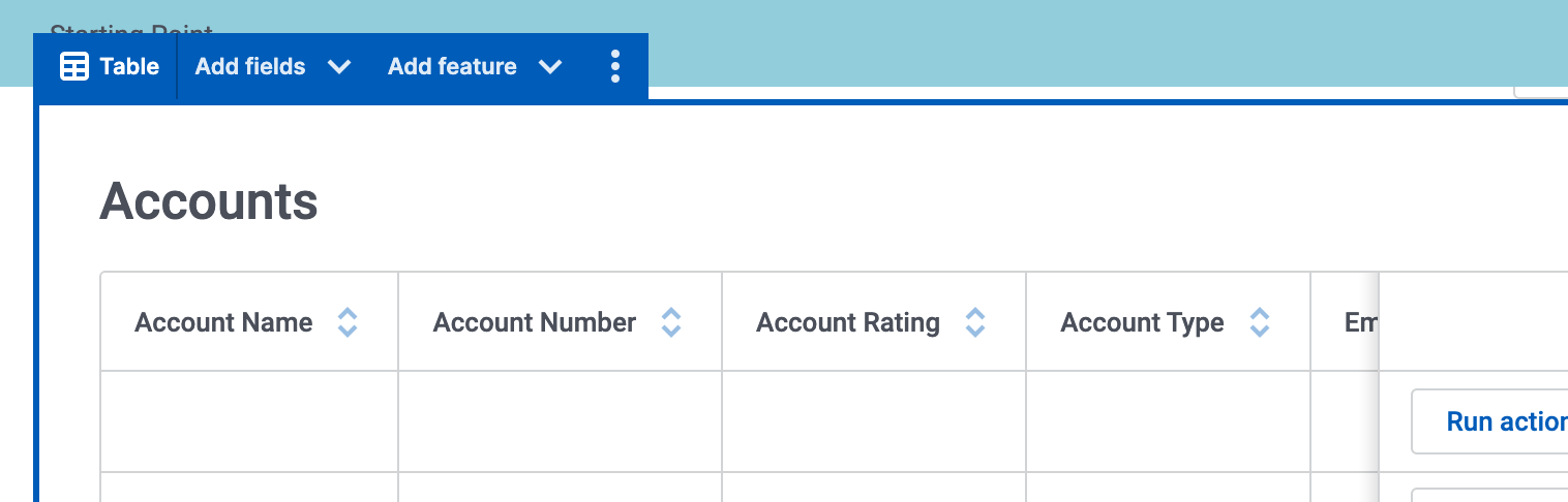
Reduced Chrome. The original composer gave a lot of space to what we call “Chrome” - the borders and labels around each component and component section. In order for the canvas to be a more WYSIWYG experience we have removed almost all this chrome.
The Challenge of Navigating a Skuid Page
Removing the Chrome from a page introduces a challenge. How do you navigate around the page? If you can’t see references to your components in the canvas, how can you quickly target the right part of a component to expose its properties? How will you know if you are in the right spot?
We have introduced some features to help navigate this more “WYSIWYG” canvas.
- The index has been elevated in the new composer to become a much more essential tool. Look for it persistently on the left side of your page. A new muscle memory of Skuid building will be to use the index to quickly choose components for configuration. You’ll quickly build pages by dragging new components directly into the index. We think you’ll like it.
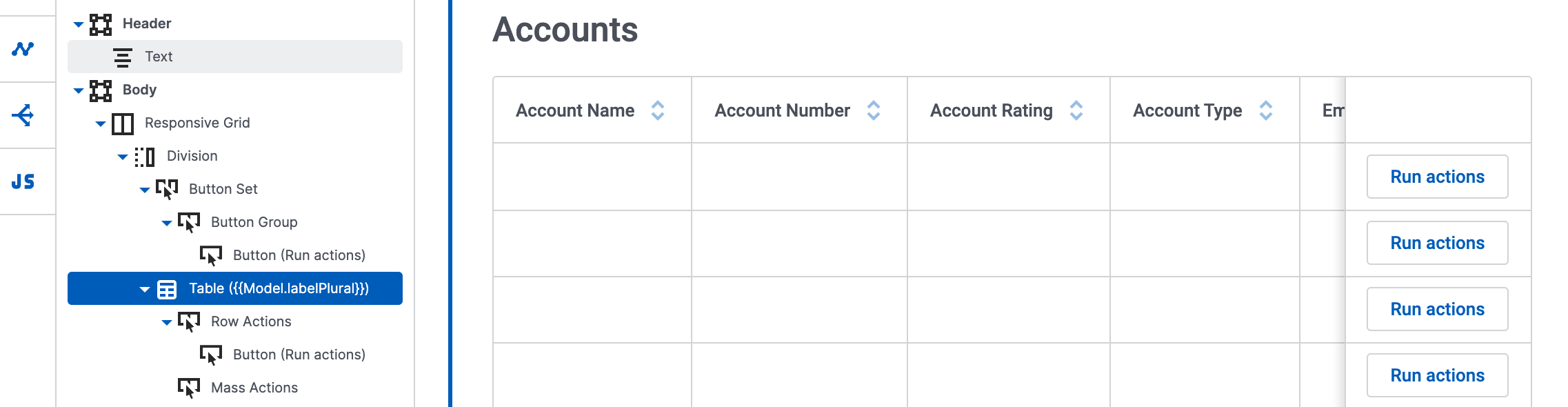
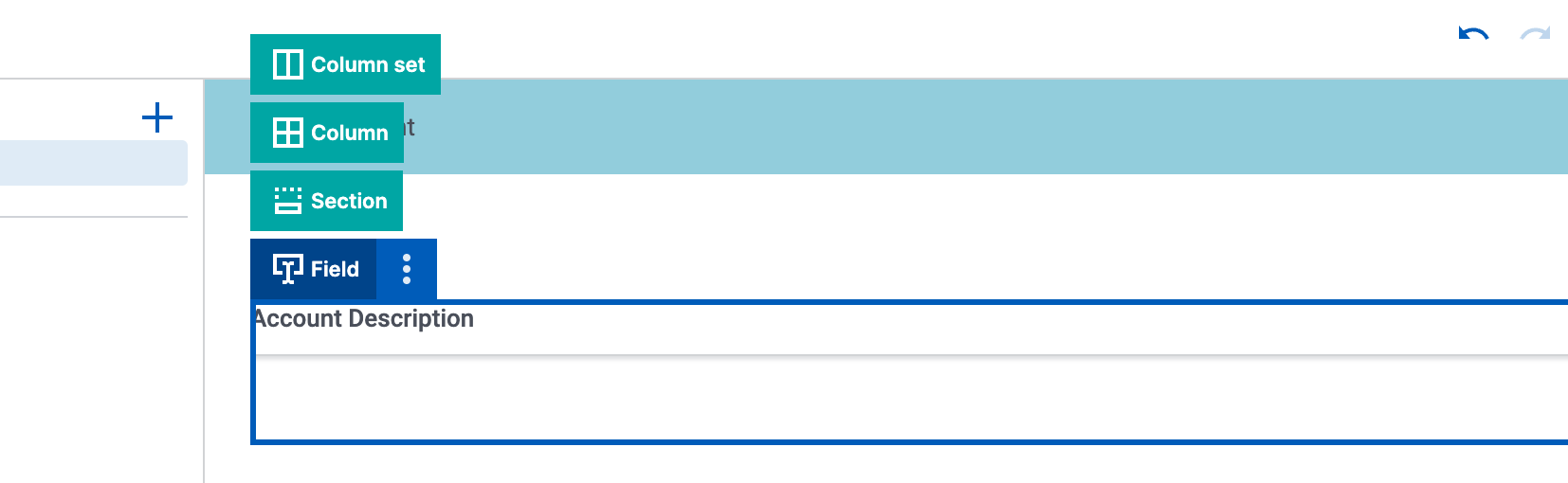
- Component Toolbars. Though we’ve removed the persistent identification of all components on the page, Component Toolbars do appear on hover as you mouse around the canvas. They also persist on the currently active component. You will know what component is being edited by seeing which component has an active toolbar.
- Toolbar Stacks. To quickly get from a component to its parent - select the Component Toolbar itself, and you will see a “stack” showing the components above it in the page structure. Click on one to expose its configuration. This is a really quick way to get from a Form Section back to the base Form itself.
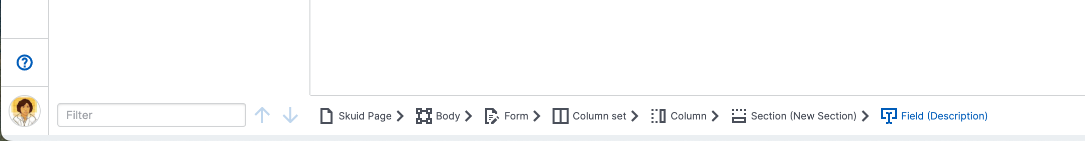
- Breadcrumbs. Another tool we’ve introduced to quickly show where you are in the canvas is a breadcrumb trail at the bottom of the page. This shows more persistently both the currently active component - but the stack of other components above it.
The Canvas experience is one of the big changes in the New Composer. We think it represents changes made for the better. But it is change……
Please let us know what you think about it.